


1
2
3
4
5
6
7
8
9
10
11
12
13
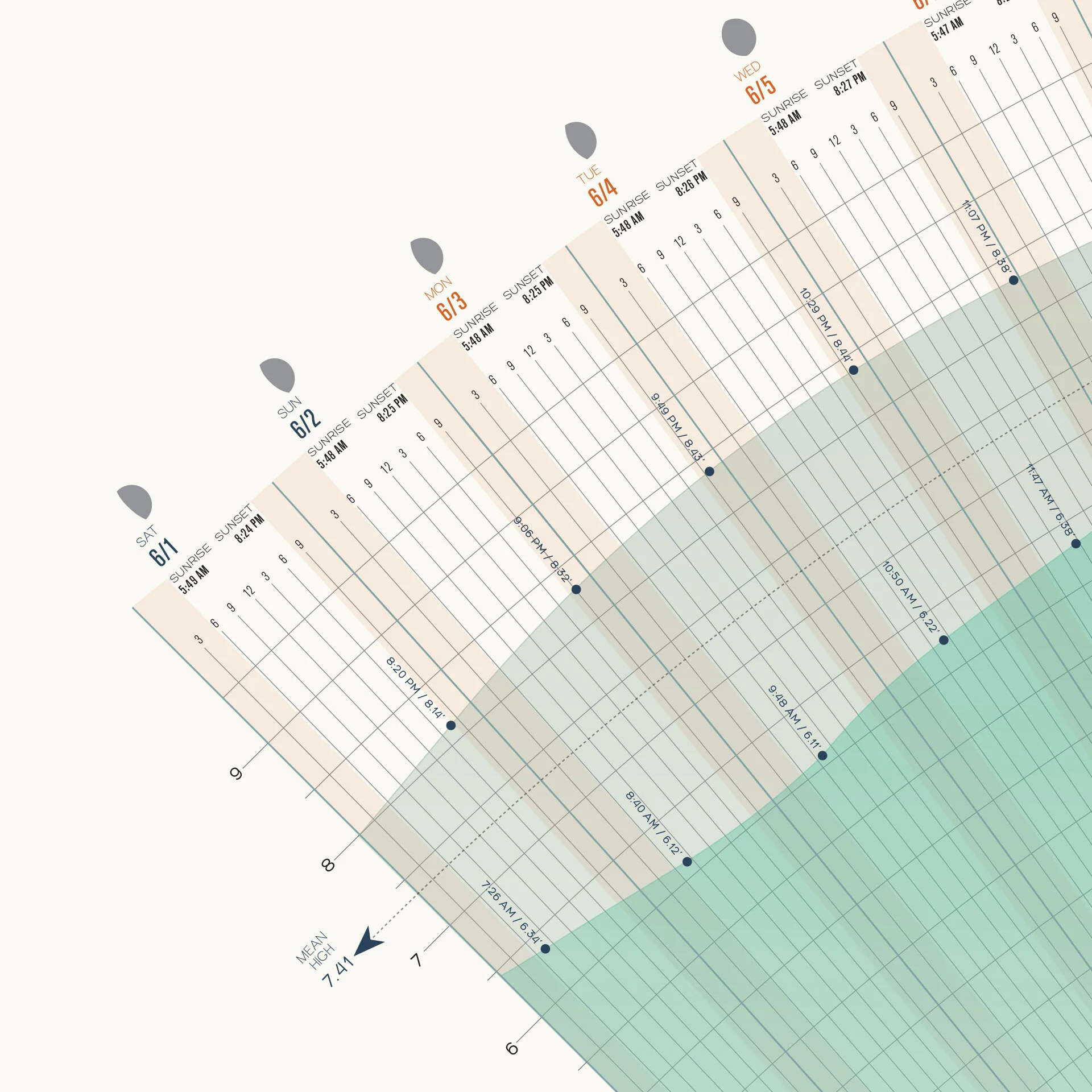
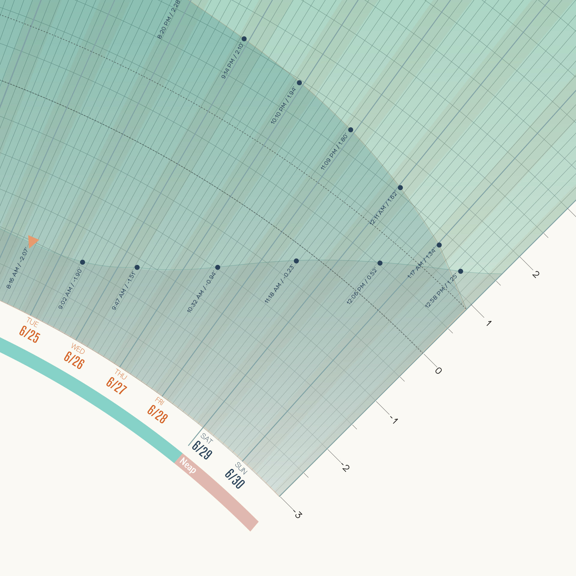
Infographic of the tidal predictions of the Redwood City Wharf.
This is my favorite project from my data visualization class during college. The objective was to create a graph showing information concerning tides of the Redwood City Wharf during each 24-hour day in June 2013. The final infographic can fit comfortably in a 40" x 25" frame. It was longlisted for the Kantar Information is Beautiful Awards 2018, and has been featured in brainpickings.org, chartporn.org, visage.co and datavis.tumblr.
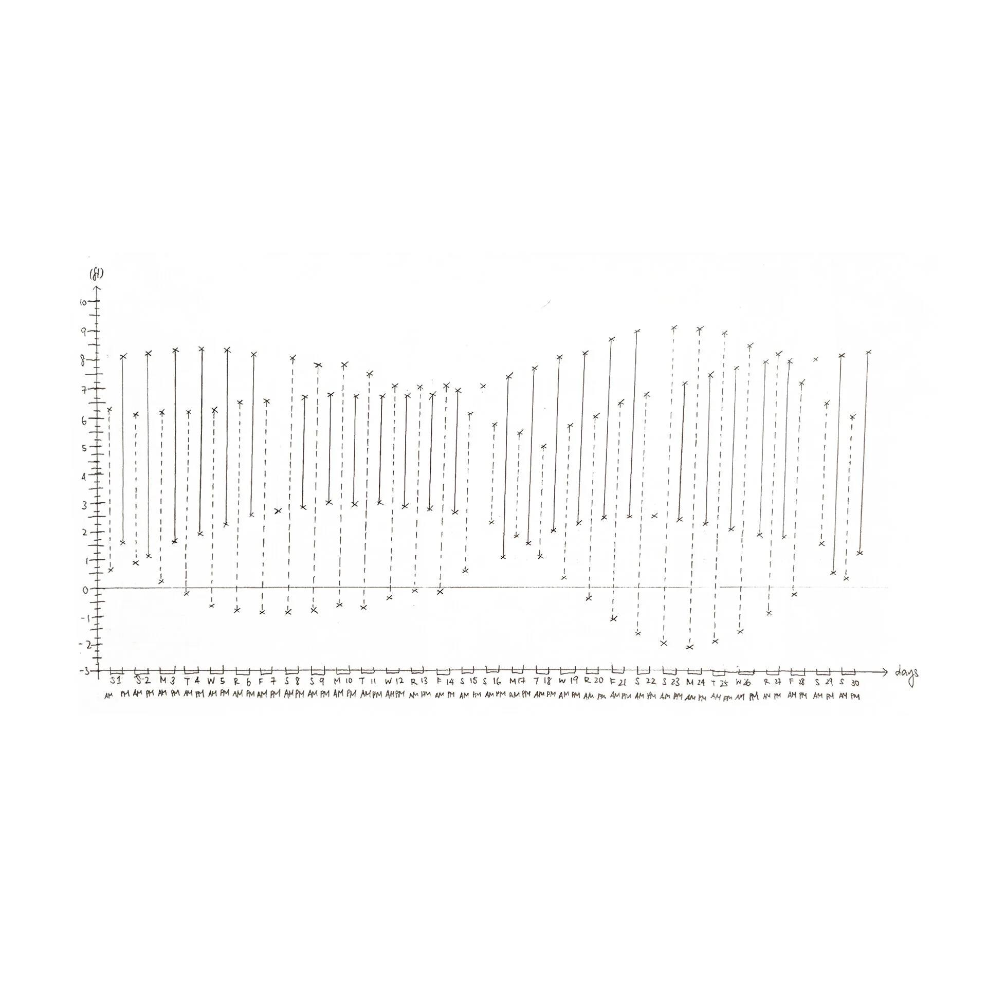
I started by plotting out the data as a graph, and sketched out other ways to make visual connections. Following the theme of oceans and tides, graph's final form explored using circles and other organic shapes for the graph's final form. I began with shades of ocean blue for the color scheme, and eventually borrowed inspiration from the warm earthy and aquatic green hues of Tycho's 2011 album art, Dive. I added graphs and summaries of other tide-related information: the causes for seasonal formation of tides, different types of tides, and a visual reference of the depth of high tides and low tides. A legend helps the viewer understand the data; e.g. the highest and lowest tide predictions are marked with red and orange arrows.
If you would like a print, please email me for more information.
Made in Adobe Illustrator. 2013.